Friday, April 22, 2011

Pittsburg State University GRADUATION!

With only a few weeks until graduation, I am more excited than ever to post my announcements.  After learning the company provided my the school was charging an outrageous $75 for 25 classy invites, I immediately started playing with my own ideas.  Of course, with my strange addiction to typography, I began to design my ultimate concept. I knew it would be most economically beneficial to just work with a simple post card layout.  I went with an offset stock to allow for a nice gloss touch on the front, but a matte pen friendly back.

SECOND RUNNER UP
This version of the invitation was something I had been thinking about for awhile.  I new once I got my idea on the screen there would be some detailed editing I would need to incorporate.  Although it was a blast to utilize symbols and shapes, it was a little too simple and a lot too childish for the college graduation announcement I was seeking.

FIRST RUNNER UP
 The edgy appeal and artistic features of this card was a little more what I was looking for. Although, with this invite, along with the previous, I was not fully catching the PSU Graduation concept.  It was a fresh design from my previous work, but something was still not quite right.


WINNER
The following card conveyed all the aspects I was looking for in a grad announcement.  My love of typography, a clean fresh palette, and a simple play on the PSU colors allowed for me to display all activities  I participated in during the past four year, as well as my graphic personality. The font used in this design, as well as the last was BEBAS.  I had fallen in love with the strong, modern san-serif a few months ago this was the perfect opportunity to implement it. Pittcraft Printing helped immensely as I am still a little more unfamiliar with stocks than I should be. (Don't tell Doug.)  :)


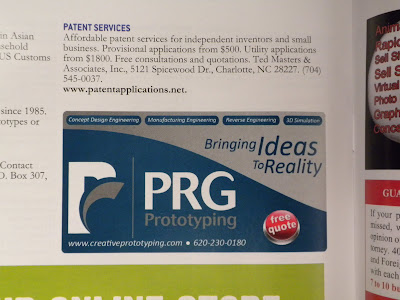
PRG Web to Print Advertising


I created this advertisement for web purposes but it ended up being edited to fulfill printed pieces as well. It was placed on InventorsDigest.com plus, it was featured in their May 2011 magazine. Also, look for it next month in the South East Kansas Business Journal!


Energy Expo: May 7, 2011

Take Charge Kansas was joined forces with local Pittsburg companies in producing an Energy Efficiency Expo for May 7, 2011.  The Pittsburg Chamber of Commerce and I have been hard at work for the last few months preparing and have began placing the final touches on the event!  Not only will the Take Charge Kansas team be there promoting their efforts in educating the community on saving money through FREE CFL light bulbs, discounted energy audits and outlet insulators, they will be taking contact information to enter into the Take Charge site which allows Pittsburg to gain points for as we are in a completion with five surrounds towns.  Right now, we are currently in 5th place so the community support and efforts will be extremely beneficial to earning Pittsburg to $100,000 grand prize!!

Below are a few advertising pieces I created to promote this great cause!

This 2" X 5" ad will be placed in the local Pittsburg newspaper, the Morning Sun.

 The Morning Sun also has an online outlet for advertising.  This banner will be placed along with a spiral ad.

 These 3" X 5" postcards were printed locally at Pittcraft Printing, they will be distributed to participating and non participating locations for a quick look at what the Energy Expo will provide.

Thursday, April 14, 2011

DeerFliction Launch


I created this graphic for the launch of Deer Timber's new apparel line, DeerFliction.  This will be utilized for marketing purposes through email, social media and the website. Below are a few potential tees I designed for the line!


Friday, March 25, 2011

Rim Shield

Working a product development firm, means everyday is a day for problem solving. This is not only in the prototype shop, but it also occurs when creating files for a number of different resources.  Luckily, we have a strong team that work well together in creating solutions for these daily issues.
Rick, the inventor of Rim Shield, came to me with an issue of creating a Solid Works file into a vector file to allow in resolution independent file to be printed at a variety of sizes for an upcoming SEMA show, which is one of the biggest aftermarket shows in the world.  Luckily, with the help of a plastics engineer, I was able to manipulate the native file enough to create the proper vision for his innovative Rim Shield product.

Rick later used this artwork in his marketing campaign to create shirts, stickers and decals. But the most exciting printed piece (to me at least) was a huge banner that was displayed behind the band Cadillac Blue as they performed one evening. Talk about great exposure!

Find out more about the Rim Shield at www.rimshield.com and check it out on Facebook and Twitter!

Tuesday, March 22, 2011

Kansas City Career Day Visits

As Vice President of the PR and AD Club, one of my responsibilities is coordinating company day tours in the Kansas City area.  This year we had the opportunity to visit Two West, Nicholson Kovac, Ink Inc. and Gear for Sports.

Every company had special aspects that peaked interest of each student.  Personally, I was extremely inspired by the company strategies of Two West.  Not only are they a leading advertising agency, they have an anthropology department that focuses on determining what customers really want and how they make buying decisions.

This trendy atmosphere has always been the place of my dream job.  I have been self-conscious about breaking into this difficult industry for years.  But after working with the social media coordinator at Two West on this visit, I was asked to send in my resume for possible consideration in the next hiring stage.  I couldn't be more thrilled!!

Gear for Sports is a collegiate apparel production company that specializes in production from design to shipping.  The design department was remarkable.  Our club members had amble time to ask questions to our accommodating guides Greg and Dana.  Not only did they take us in the depths of the company, but their tips and tricks to job searching has been extremely beneficial these last two weeks!

Senior Project - Pittsburg State University


As seniors at Pittsburg State University we are given the opportunity to dedicate an entire class to creating our own concept, artwork and production of a project.  Finally, our chance to show off what we have gained over the last four year!  I remember gazing in awe at these projects as a freshman, overwhelmed with excitement that one day I will be in that showcasing my most prized pieces.  Little did I know, that that case would hold so much more than just some cool designs. My artwork was drenched in hours of research, weeks of conceptual processing, months of preparation but finally, it was gleaming with smiles of success. 
Walking into this project with an open mind and clear slate for design, I was able to step back to the basics of design techniques. With the freedom to run in any direction I was slightly overwhelmed, as it was my first chance to take on a project at this level with out any assistance. It was an true test of my patience, time management and dedication. 
My idea to create the pieces for a marathon was based by personal experience.  My participation is a marathon relay and 10k race was a challenge of physical, mental and emotional strength.  These runners passion and thrill for the sport was so inspiring, I couldn't help but gather information about the putting an event like this together for such passionate people to be a part of. 
The Hilary Chance Foundation was based on a women whom personally experience the difficulties of survival after returning from war to a lonely world.  She was able to fight against all odds and earn a college degree.  After graduating, Hilary dedicated her life to helping at a local Chicago shelter where she would aid others in the skills of self confidence and work ethic until they were prepared to enter the job market.  The shelter now depends on donations and fundraiser to keep their doors open. The Hilary Chance Marathon is an annual race in efforts to keep this amazing program working.  They have raised over hundreds and thousands of dollars to construct the poverty stricken into job seeking professionals.
Each piece was meant to work into one collective design. I chose two strong colors along with two prominent fonts to focus on the energy and and strength of a marathon. Also, I went with a rough brown craft paper for a thick stock.  This of course brought the feeling of an environment friendly event. 
This race was devoted to its athletes.  I featured variable data in a different aspects of my project.  This was a differentiating factor from other marathons, as The Hilary Chance Marathon knows its participates and personally respects their dedication to assistance the aid of the program.  Each runner received two post cards leading up to the big race.  Each with information specified to their previous race time.  Also, participates were able to pick up a certificate at the end of the race with their finishing time printed on it. 
The total project included: 
Subway Poster, Variable Data Post Cards
Race Day Bib Number, Race Day Catalog, Information Brochure on The Hilary Chance Foundation
Printed Race Bag, Marathon T-Shirt, Water bottle, Hilary Chance Pre Race Power Bar, Hilary Chance Post Race Recovery Bar, Towel, Silicon Bracelet, Variable Date Finishers Certificate and Medal.